5 Small UI/UX things
Few of the small UI/UX lessons I picked up at Frappe that make a big difference.
Let's get straight into the stuff you are here for!
1. Button Invisible / Disabled
About 3 years ago, while implementing the branch switching feature on Frappe Cloud, I got on a call with Faris for a review. I was very new and this is my first feature PR on Frappe Cloud.
To explain briefly, when the user selected “Switch” branch option for an app, a dialog opened with a select input to select a branch. This dialog had an action button to confirm the change:

I demoed this to Faris and he gave me a small but very important UX lesson on this. The issue was, the button remained disabled (IIRC I even had tried hidden 🤣) if the selected branch was same as the branch which the app was currently on. It was clear to me as a dev, but Faris pointed out that users might get confused on why the button is disabled and what should they do to enable it. He suggested to keep the button always enabled and show a message on click if they haven’t selected a different branch.
I have applied this learning to many situation till now.
Disabling/Hiding the action(s) till things become valid will most probably confuse the user (specially first time users), it is better to show them a specific message on what they have to do in order to make things valid.
2. The Multiple Primary Actions Sin
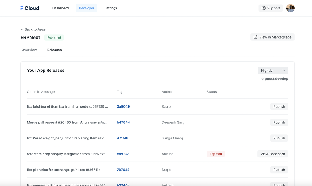
Can you spot what’s wrong with the UI shown in this screenshot?

It has 3 primary buttons in one view! THREE!

Now, how do you decide which one should be the primary action? Well, you have to think what is the primary thing or the main task for which the user is on this screen for, in general.
Let’s look at the same screen in the new Frappe Cloud dashboard and then I will try to explain a bit more:
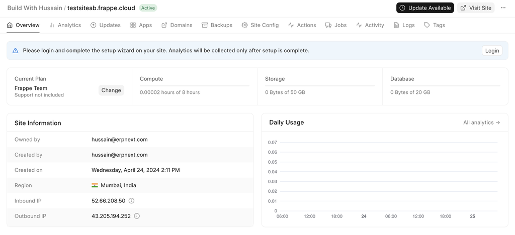
“Update Available” is the only primary action now. Because that’s the task at hand. Visiting the site is not the important action here because it’s just a link that takes you to your site. The info banner is already catching attention with its color and we don’t need to make this a primary action just to get user attention. Many important UI/UX design principles rely on managing user attention (e.g. visual hierarchy) and having multiple primary actions inside a single view causes distraction.
As a rule of thumb, any given view should have only one primary action and rest should be secondary or tertiary actions.
You may ask, why 2nd biggest crime? What’s the biggest then? I have saved it for the end 😉
3. Third One
Observe the below UI and focus on the copy of the UI elements:
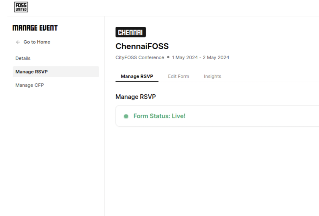
Can you spot what I am trying to point out? Let me explain with annotations:

Get it? Redundant Labels. The word “Manage” is used far too many times and is cluttering our copy in my opinion. Here the context is provided by proximity. Again, first look at how we fixed this and then I will explain the changes:

Here are the changes we made:
- The word ‘Manage’ can be removed from the navigation links, we are already inside ‘Manage Event’
- The heading inside the tab can be removed altogether, the navigation link label says ‘what’ you are managing
- Changed the tab title from ‘Manage RSVP’ to ‘Overview’ because that’s what this tab contained
Let’s take one more interesting example for the same concept:
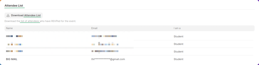
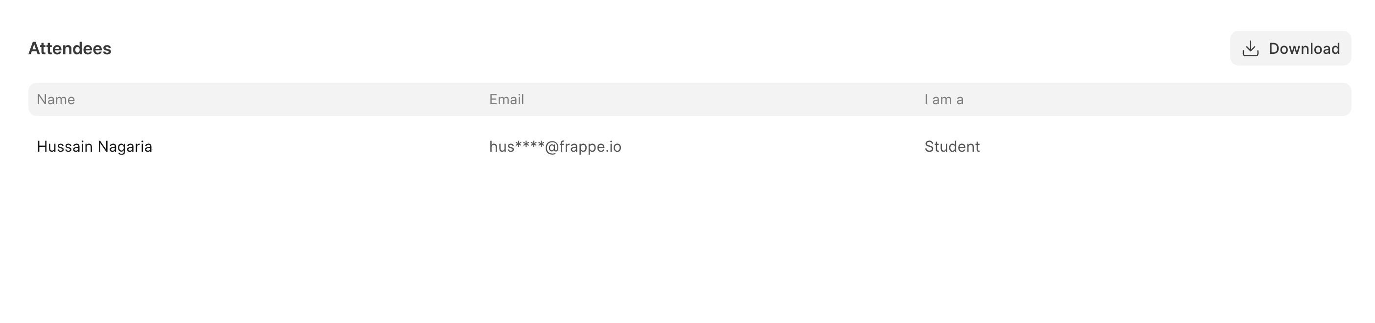
And here is how it looks after some fixes:
 Less is more
Here is what I changed and why:
- Changed ‘Attendee List’ to ‘Attendees’ making it less verbose and also it is very clear that this section is a list 😅
- Changed ‘Download Attendee List’ to just ‘Download’ and also moved it on the same row as the title of this section. The user knows what will get downloaded.
- Removed the description for the button. This button is self-explanatory.
Well, we can stop here or take a bit of inspiration from Frappe Insights:
Here the button is in the footer of the table and it just has a download icon. This works and won’t leave the user confused for two reasons:
- Due to proximity it is clear “what” will be downloaded
- Due to consistency of how the download icon looks in other applications, we don’t have to label this icon.
Note that having an icon-only button works only because it is standard among applications (one more example would be the plus icon or the pencil icon). Make sure you don’t assume an icon’s meaning otherwise it might end up hurting the UX instead.
4. Mono
Moving on, this screenshot is from a different pull request of mine:
I had a feeling something doesn’t look right. But what is it? The alignment of the items in the Tag column looked odd but I couldn’t think of a solution. Faris to the rescue again. He suggested to change the font to monospace and it started to look good!

For things like commit hashes or generally fixed length strings in a column, this works very well because monospace fonts take the same amount of width for same number of characters.
5. Broken Aspect Ratios
 Shariq, the straw hat pirate
This generally happens due to these two reasons:
- Not resizing images proportionally while editing (i.e. resizing width and height of an image in separate scale)
- Broken aspect ratios while rendering
imgelements or background on web pages
The 1st point can be taken care of by making sure you have “locked” proportions while resizing any image. The second one can be solved by making sure the image element is properly styled to handle different image sizes (specially, if it comes from some CMS). There is also a modern CSS property for the same.
Now, according to Rushabh, this is “the biggest crime against humanity”. A bit of an exaggeration? Maybe 🤣
Epilog
Writing this article reminded me about the importance of pair programming and 1-on-1 reviews. Tips and tricks like these are not taught in college. We learn them when we build stuff in the wild and seek feedback.
See you later!
Thanks to Faris and Shariq for the review and feedback on this blog!
- Loading Reactions...
About the author

Hussain Nagaria
Hussain is the host of #BuildWithHussain on YouTube and a training expert at Frappe School. He has a passion for teaching and building stuff!